

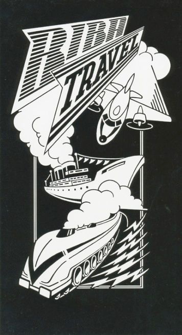
Here are two black and white drawings, one for Biba sun and the other for Biba travel.
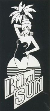
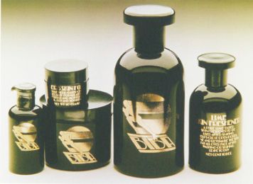
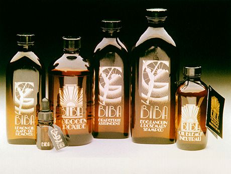
Biba sun was the logo to be used on bottles of oils and lotions for the holiday skin-care range. I do not know whether it was used but it would have looked beautiful in gold on brown or black. I loved that combination , it looked so rich and classy. Here are some of the other health care ranges including one for men.
Men’s health care range.
Women’s health care range.
Nowadays sun products look like they come out of a sterile clinic with insipid colours, usually orange and white . I went back to good old olive oil, with a beautiful label of course.
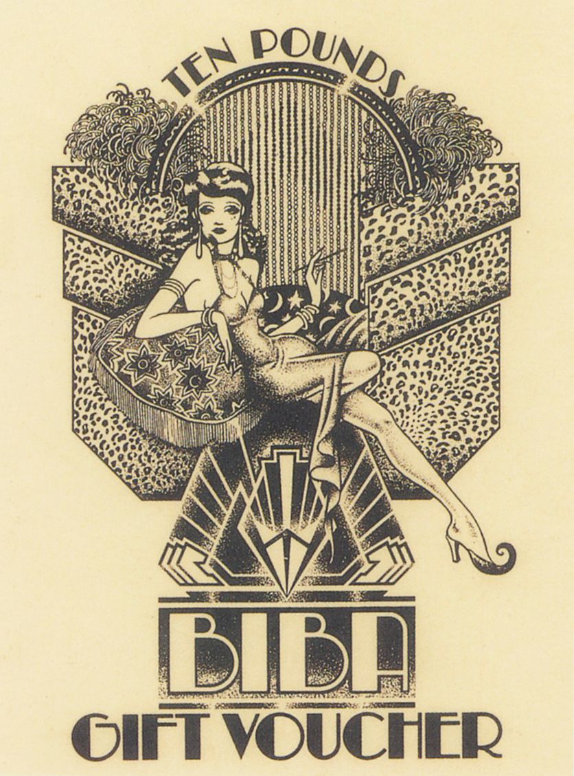
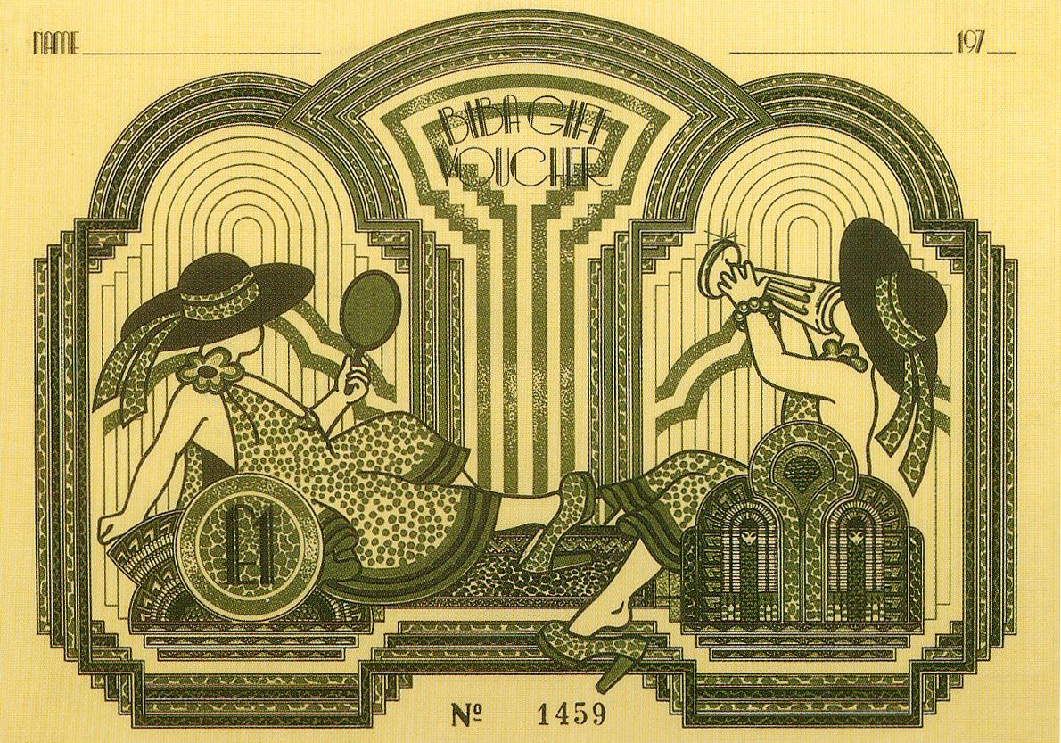
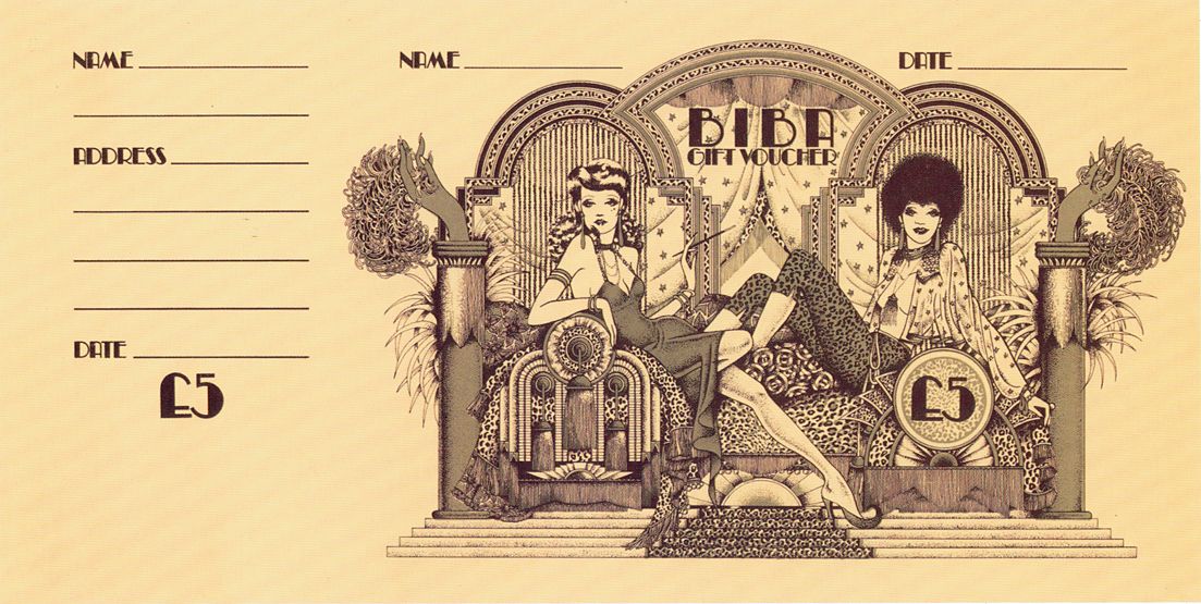
The Biba travel is a total mystery to me, I vaguely remember doing the illustrations but I have no idea what it was for. The gift vouchers I had great fun with, Steve designed them and I filled them with Biba ladies lounging amongst the finery.
Biba kid’s gift voucher.
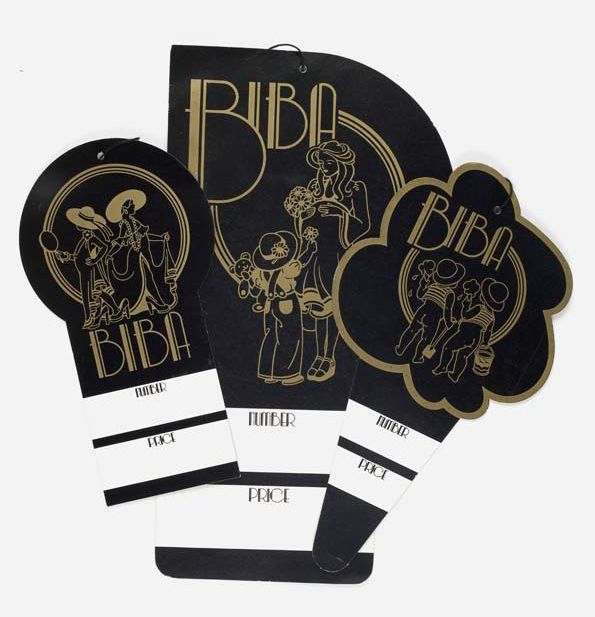
They look as if they were probably for sale on the men’s floor.
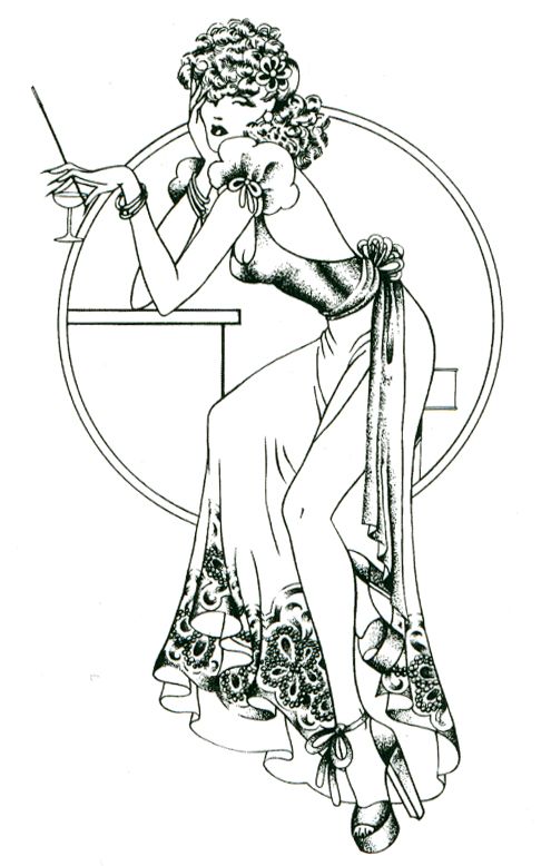
Here are some of the labels, the pregnant mums is a big pregnant ‘p’, and the Biba babies an ice cream cone. Finally , one of my favourite pinup from the men’s colouring book, a slightly dissipated Biba lady ‘Lucious’ but still looking elegant.
Biba labels Kid’s floor, Pregnant mums, Biba babies.